
HighLightIt! Dashboard
A thinking environment that helps coaches and analysts make sense of data
Why this exists?
But more charts doesn’t equal better judgement. Coaches need meaning, fast.
This is built to be plug and play.
A clear layer between numbers and action: Inspect, Compare, Discuss.
The 3 lenses
Same dataset. Three views. One goal: help people ask better questions of performance.
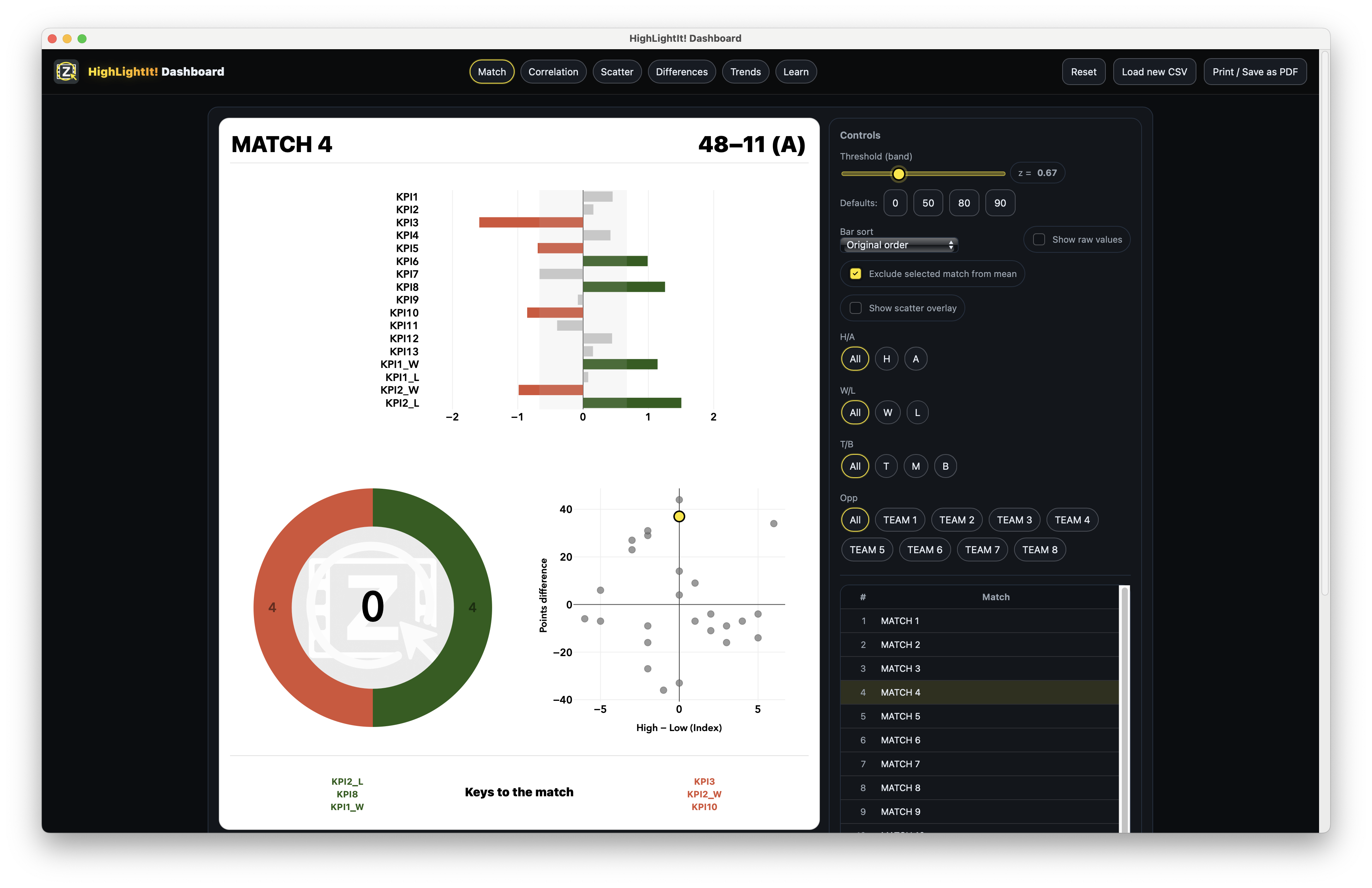
A quick scan that makes strengths and weaknesses obvious. Coaches get “what mattered” without wading through tables.
Use it for: debriefs, Monday review, player conversations.
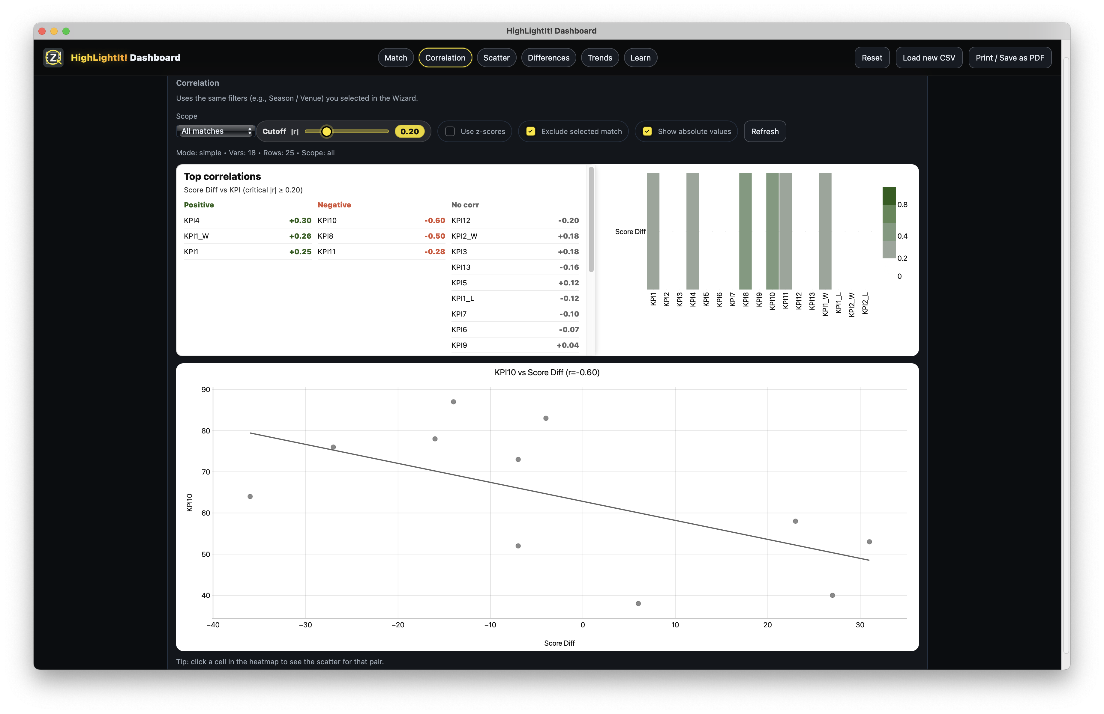
Transparent, teachable methods that help people learn what’s usually connected to winning (or performing well). No black boxes. You can always explain why a chart looks like it does.
Use it for: KPI selection, learning themes, staff alignment.
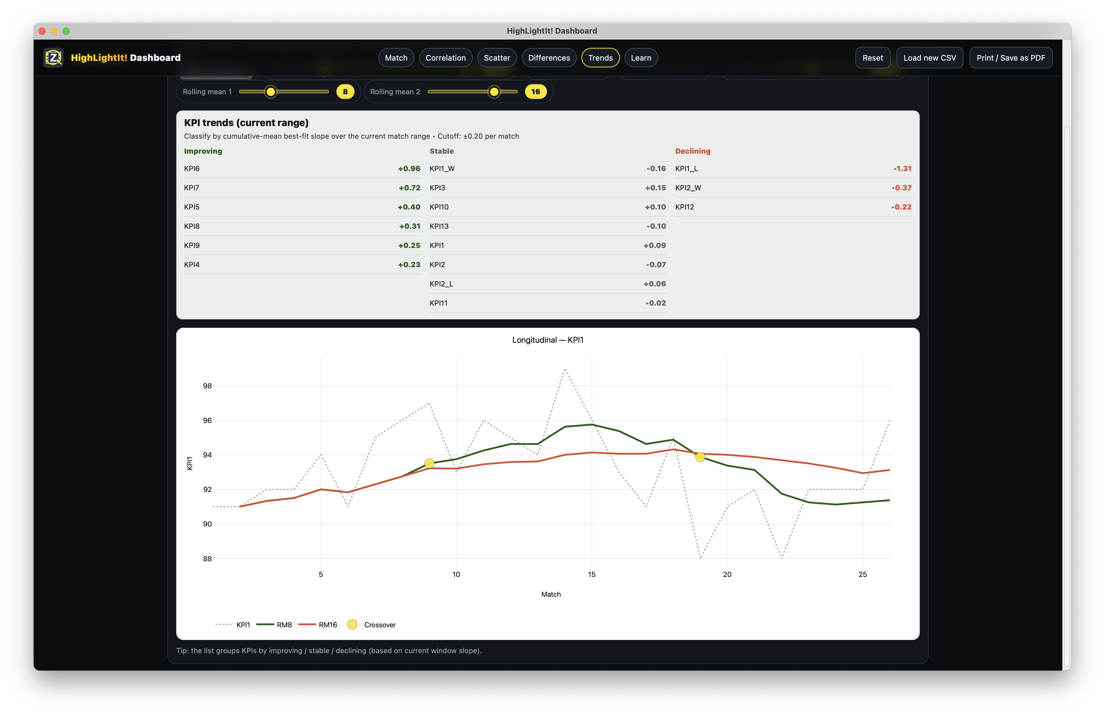
A coach-friendly time view that answers: is this KPI moving, shifting, or just noisy? It helps you spot drift, improvement, and “something’s changed here” moments without over-reading single games.
Use it for: blocks, transitions, squad changes, and early warnings.
How it feels (30 seconds)
Add your CSV. That’s it...
It’s built for real coaching tempo
Everything is transparent and teachable
Who it’s for
What mattered? Then: what tends to matter? Clear prompts for better conversations.
A scaffold for reasoning — a place to test, compare, and communicate.
Perfect for teaching analysis: transparent stats, consistent visuals, and discussion-first design.
Design principles
Outputs are prompts — not verdicts. The tool supports curiosity and reflection.
Familiar chart forms, consistent scales, and simple emphasis. The goal is fast scanning and shared understanding.
“Was this normal, better, or worse?” The maths stays transparent — the meaning stays coach-friendly.
No messy spreadsheets or static dashboards. This is the storytelling layer.
Want more detail?
This page introduces the thinking philosophy behind HighLightIt! Dashboard. If you want to explore the underlying ideas in more depth — including context, comparison, change over time, and how to interpret indicators responsibly — there is a deeper theory page available.
Go beyond raw totals and percentages. Learn how performance indicators only gain meaning when viewed relative to history, variability, and situation.
Understand how the Dashboard supports fair comparison across matches and highlights genuine change without over‑reacting to single games.
A plain‑language explanation of concepts like standardised comparison (e.g. Z‑scores) — framed as coaching questions, not mathematics.
See how the Dashboard is intentionally designed to support discussion, reflection, and shared understanding rather than judgement.
Access
Contact
support@highlightit.studio